


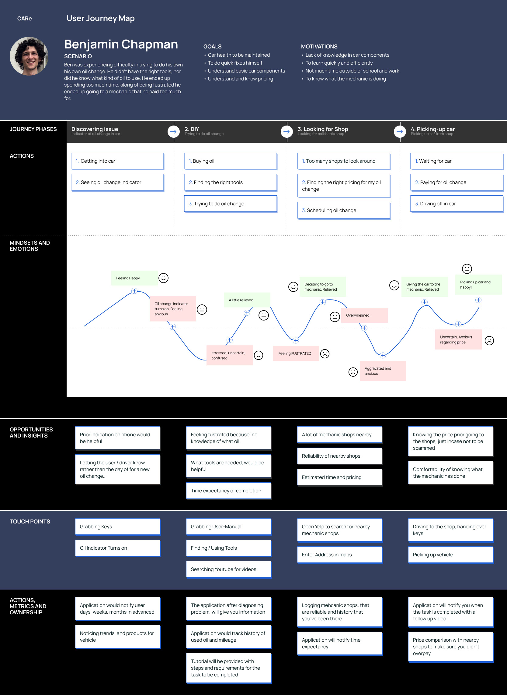

How might we display proper information to help the user understand what is going on with their vehicle?
How might we give assurance to the user that they are picking the right shop, without being scammed?
How might we give the user the ability to properly learn the steps in trying to repair their vehicle?
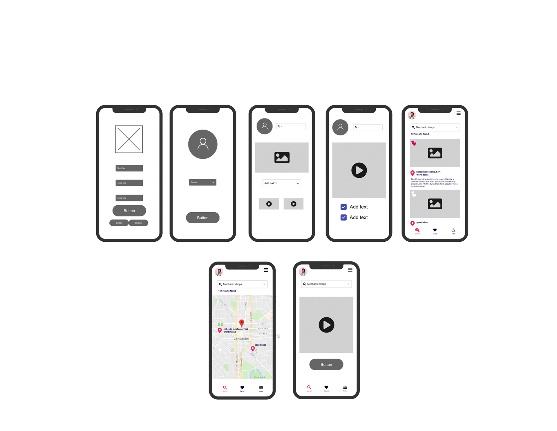
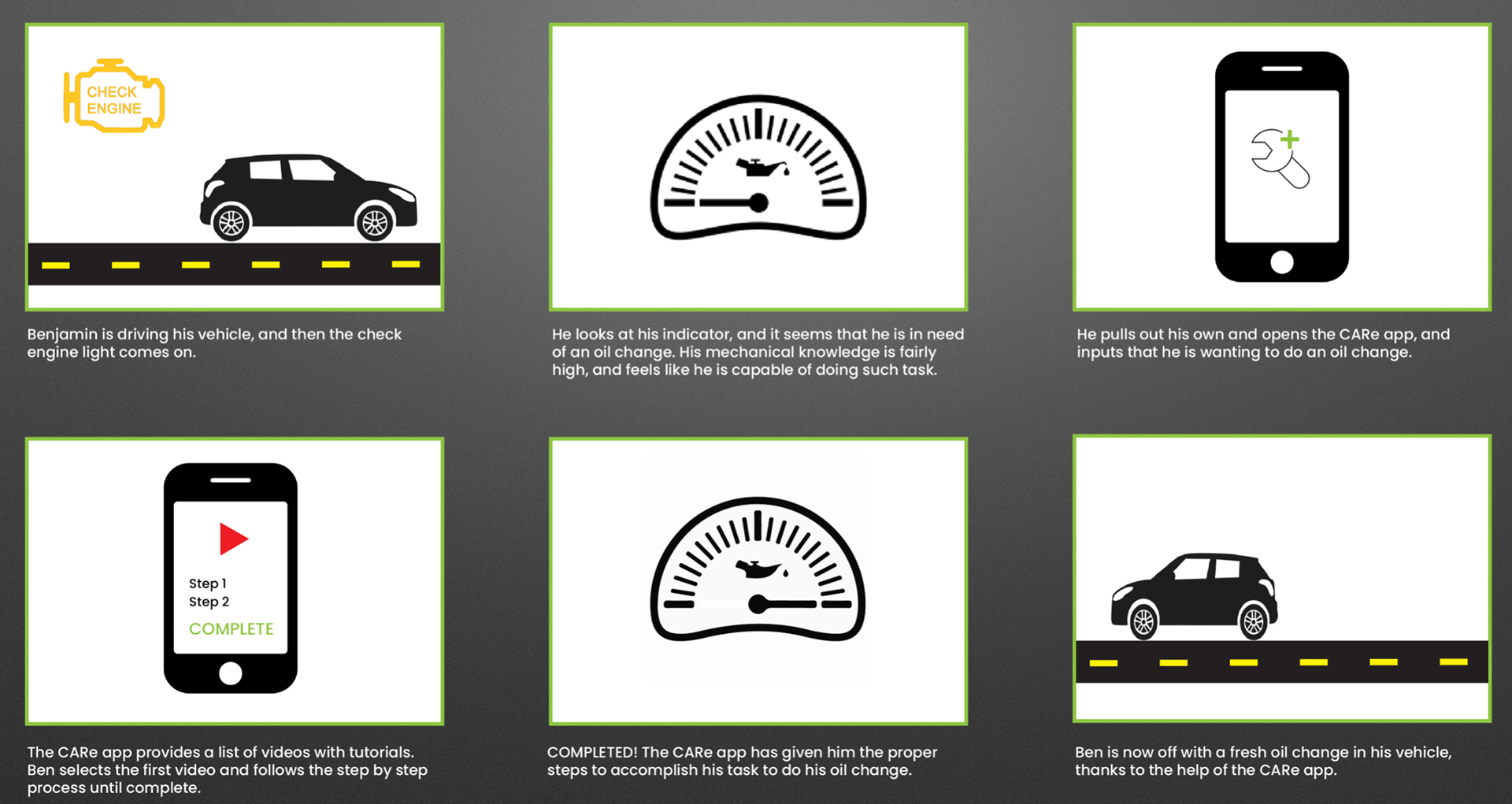
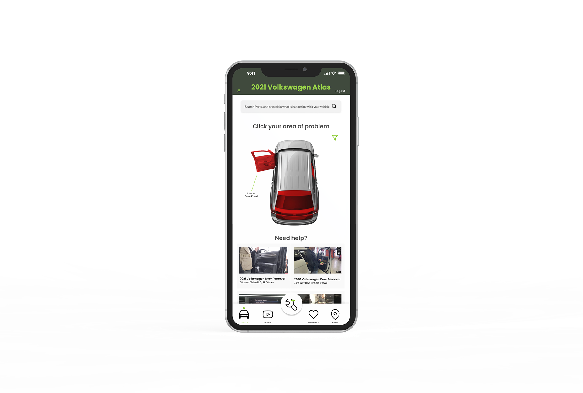
These low fidelity wireframes are designed to guide the user through a friendly experience. This is a simple interface with an onboarding process that is designed so that the CARe app is catered to the user and so that they can have tutorials catered to them, and their specific vehicle. As you proceed they will move onto the dashboard where they can further view their vehicle in an interactive diagram and diagnose the problem, with. a step by step process on how to fix and recommended nearby shops.

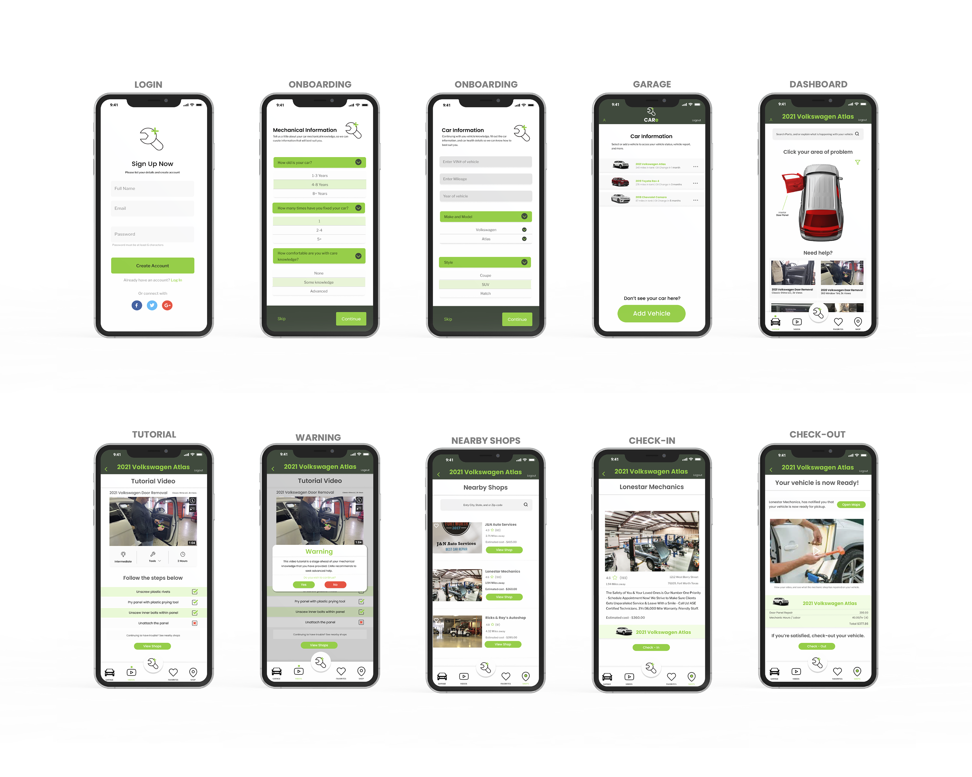
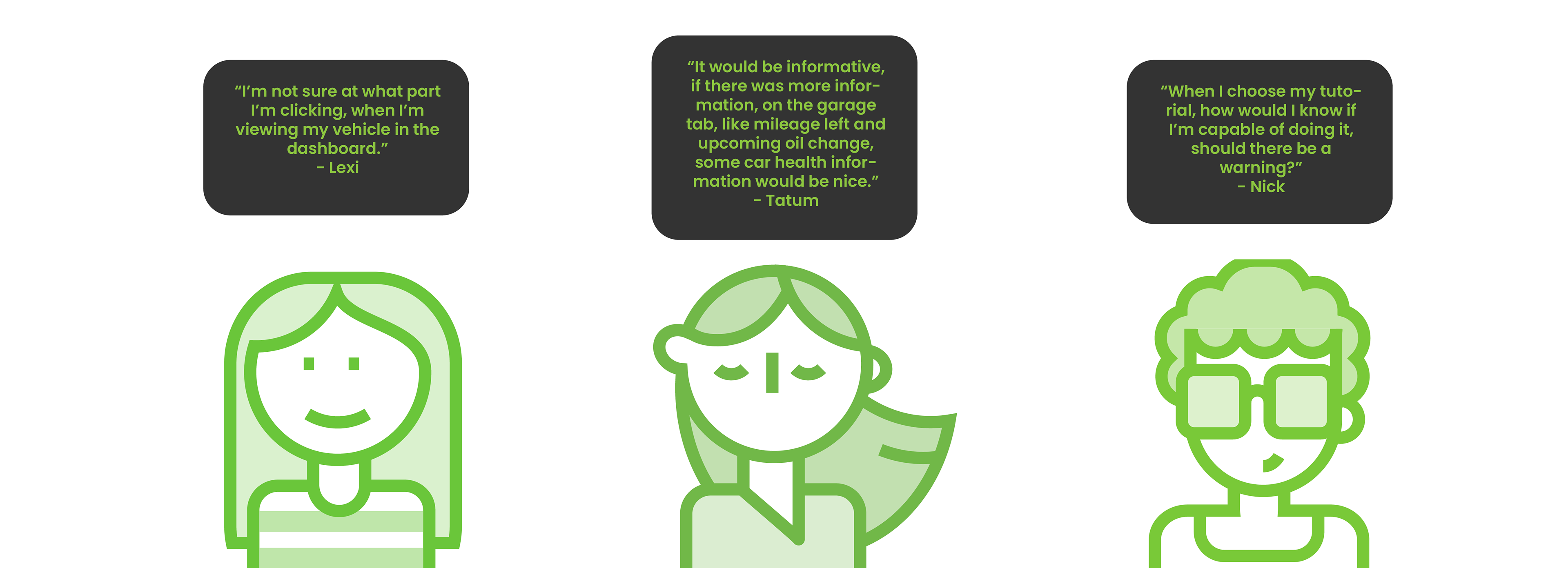
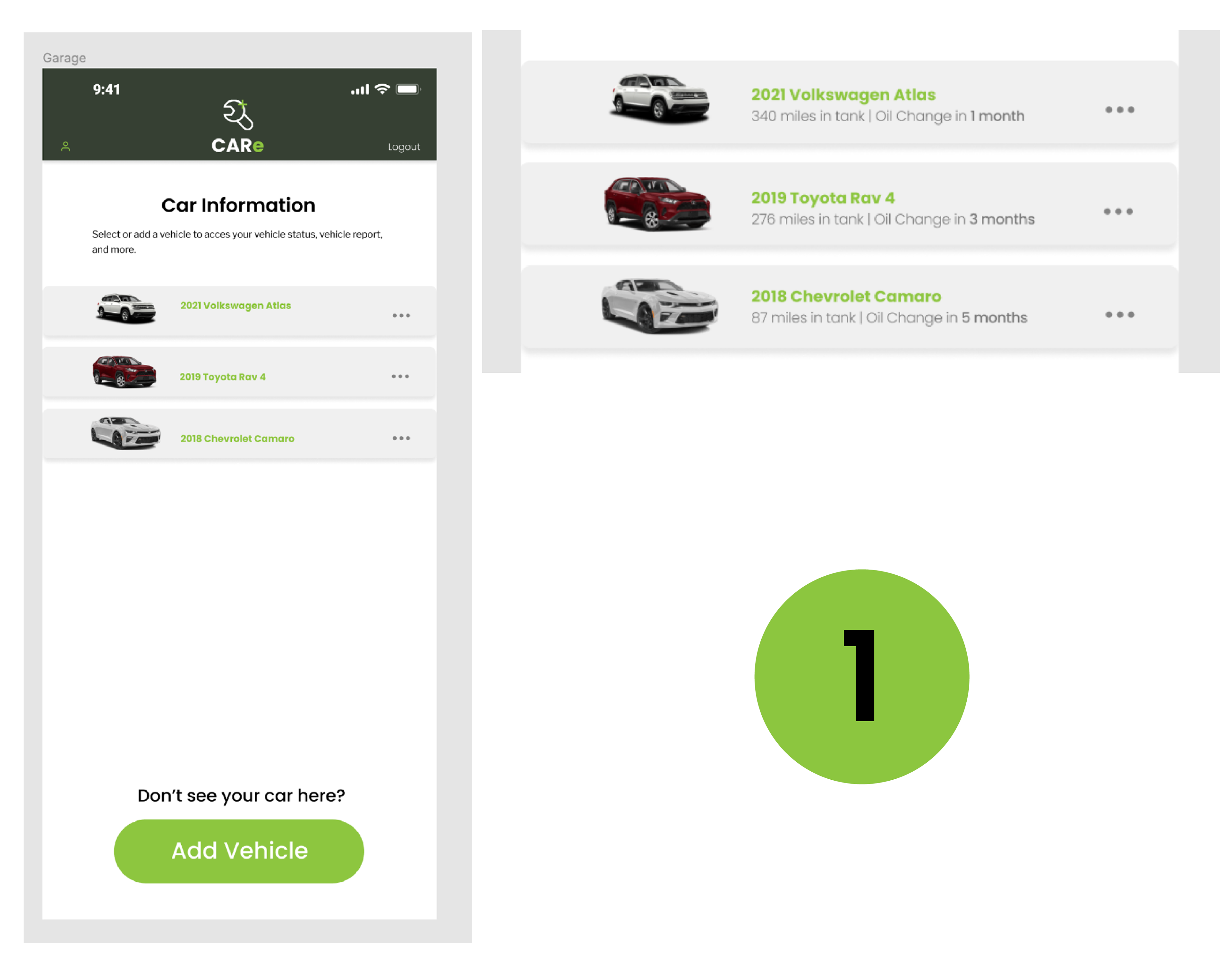
Based off of user feedback and testing from Tatum, I have made my first iteration from the prototyping phase. In this instance the changes that have been made, were to provide more information in the garage screen. As you can see in the image, the garage screen just had a list of the vehicles that you own, but now with the new iteration the garage screen now provides basic information, with upcoming oil change information.
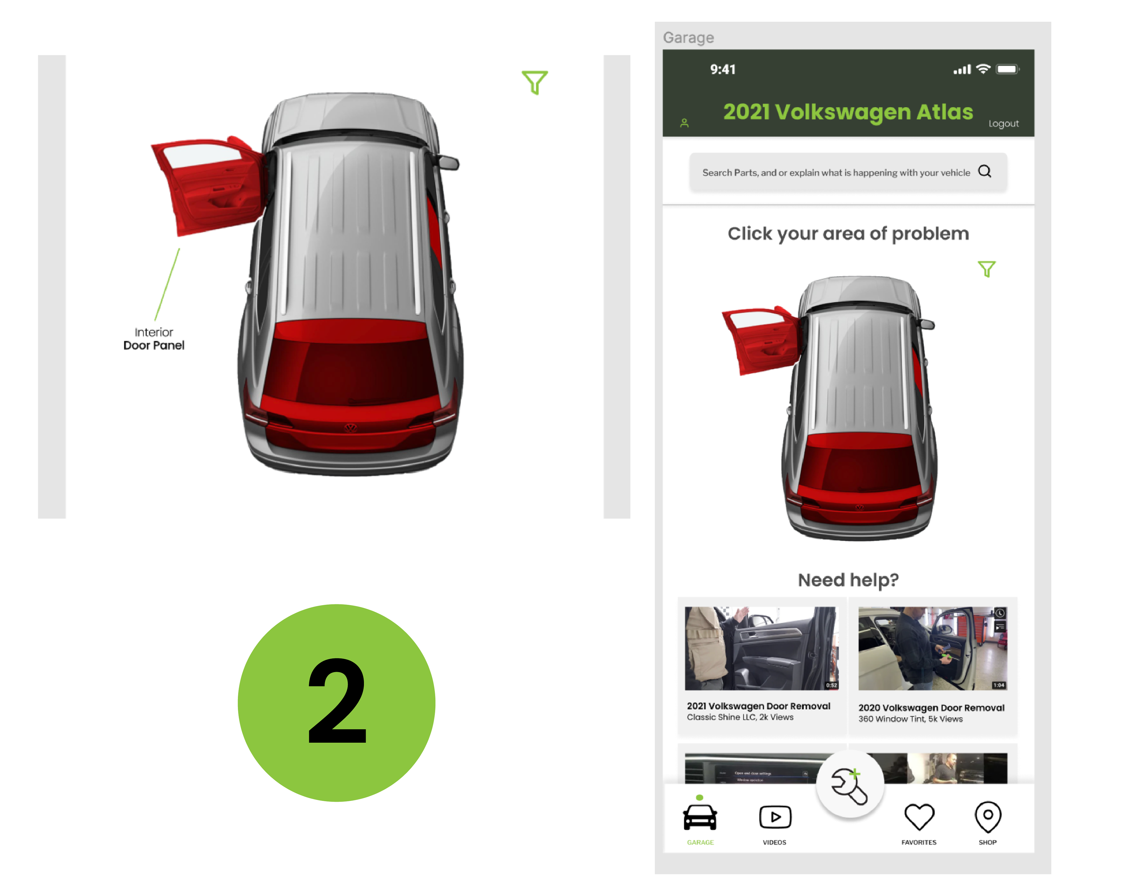
Continuing with user feedback and testing, Lexi has suggested to add an information rule. By adding this rule, it will indicate what vehicle component you are clicking, and will provide a name and information regarding the part. Without this suggestion, the user wouldn't know the exact part they are picking, so this was a very helpful.
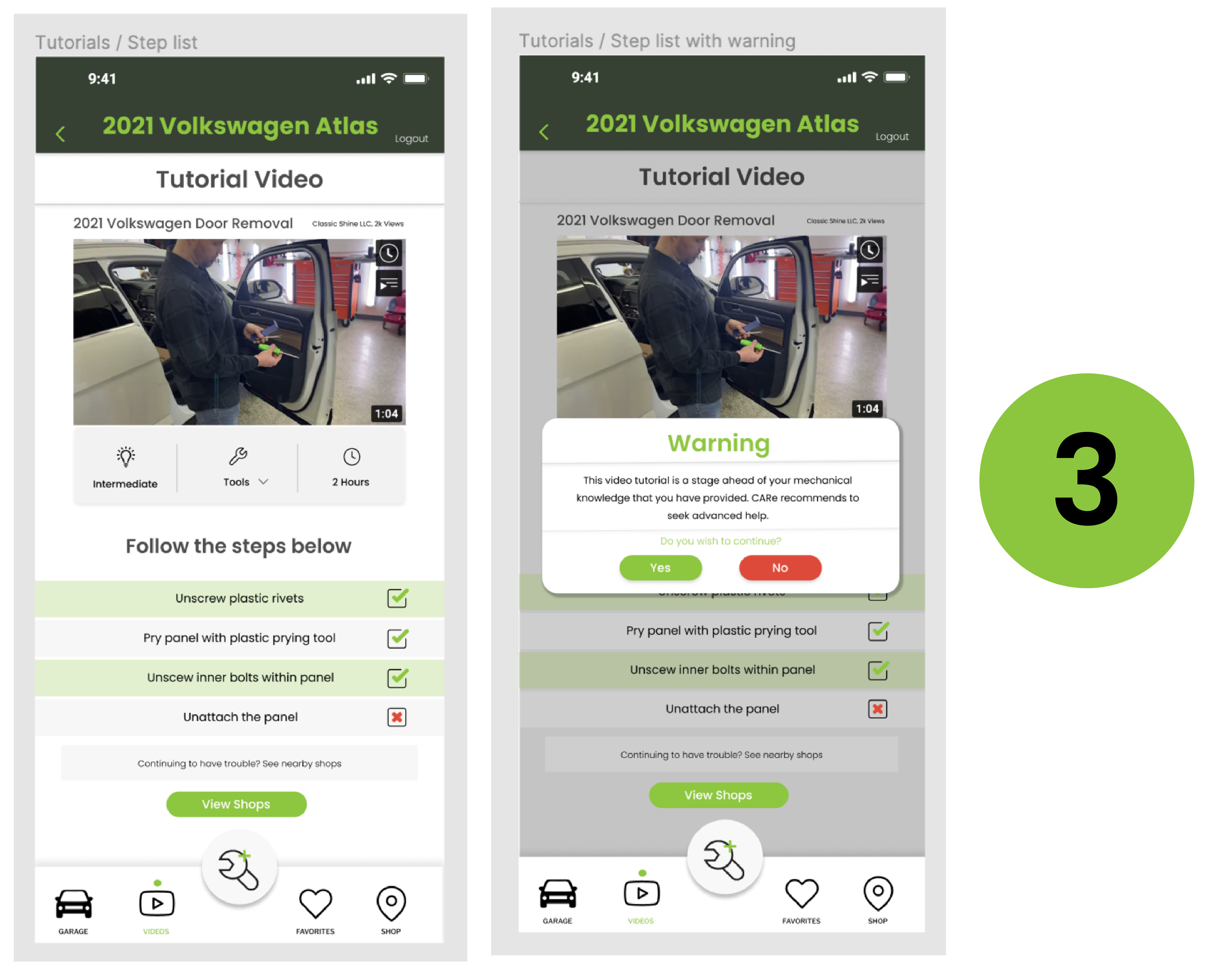
The last iteration that was made was the warning screen. The warning screen was added to provide a warning if you wished to continue for the user if the DIY was out of their level of expertise and to go straight to the recommended shops that are nearby.