The Garmin Ad Campaign was designed by my partner Tatum Smith, and I. We created a concept of promoting Garmin as a versatile company being able to show their wide variety of products in numerous settings. We chose a muted/slate color palette that gave a cohesive technological aesthetic, while keeping them in the natural earth tones of brown, green and blue. We also incorporated the blue color from the accent above the N on the Garmin lettermark, and associated the type family Termina to be consistent with the characteristics of the Garmin lettermark.
We took all of the images ourselves with only using the mock ups as photoshop placement. Everything is done by hand, with lifting and post editing in adobe lightroom and raw.
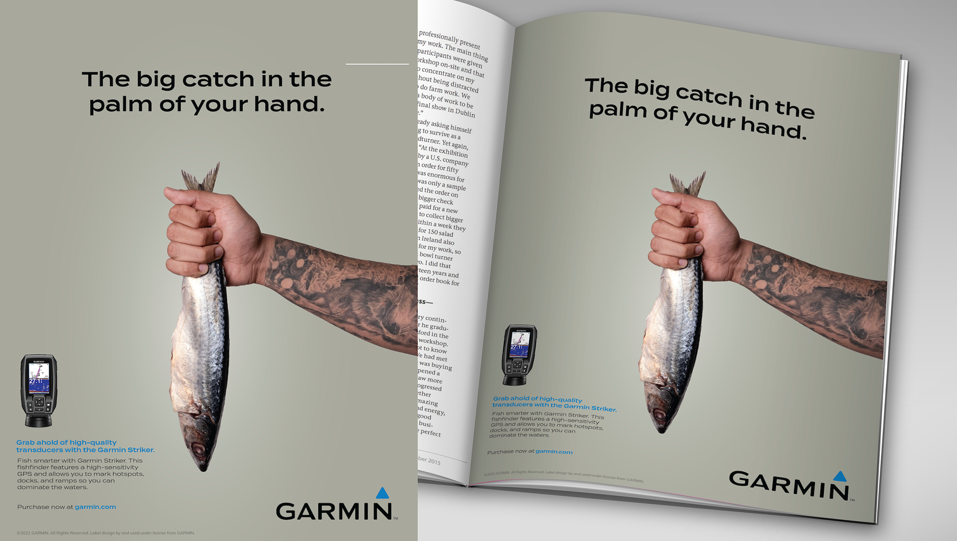
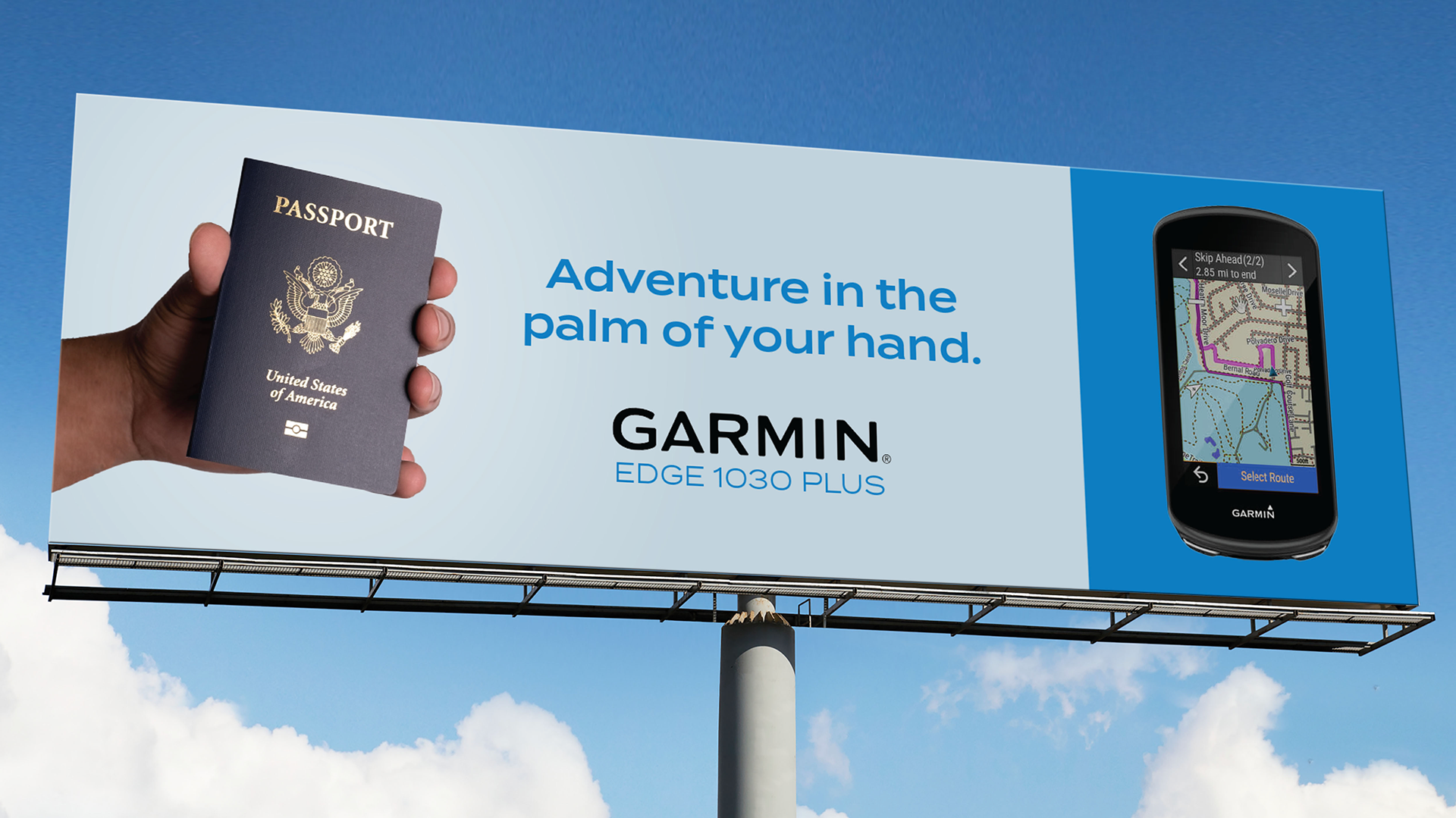
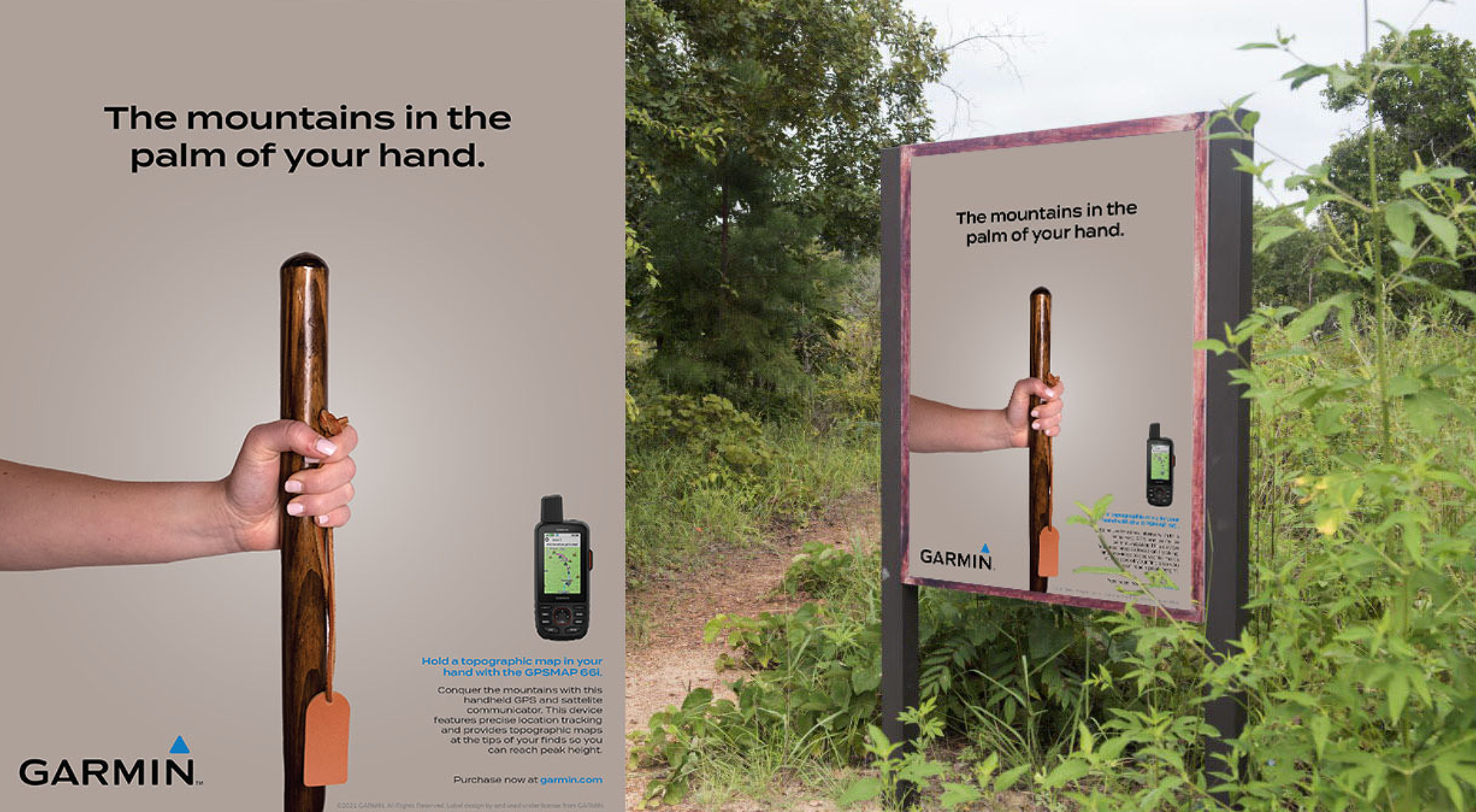
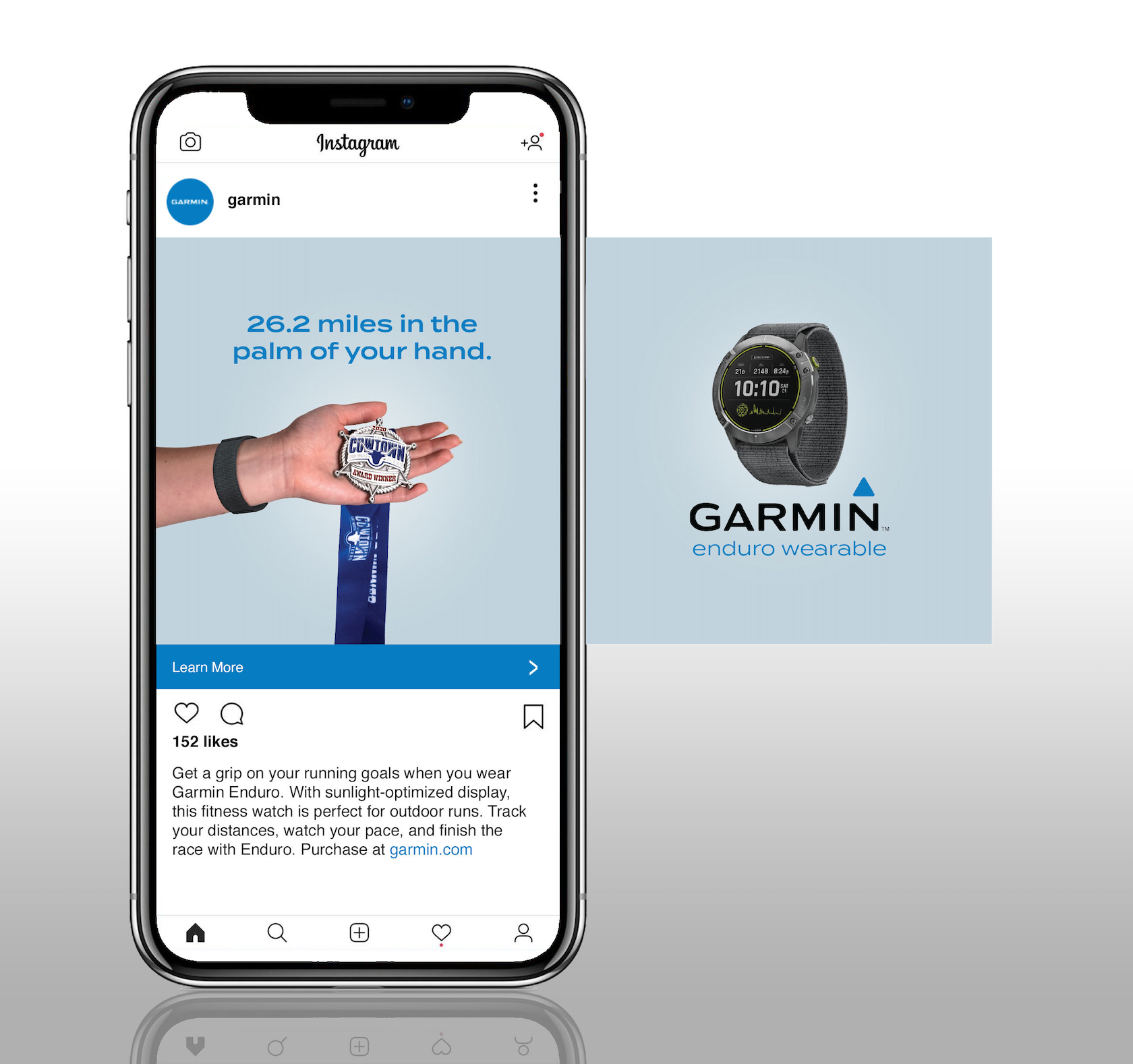
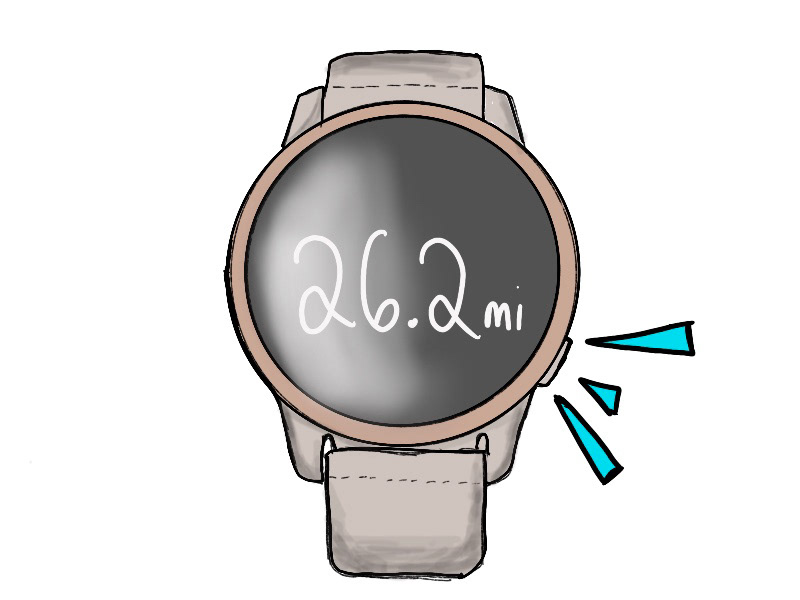
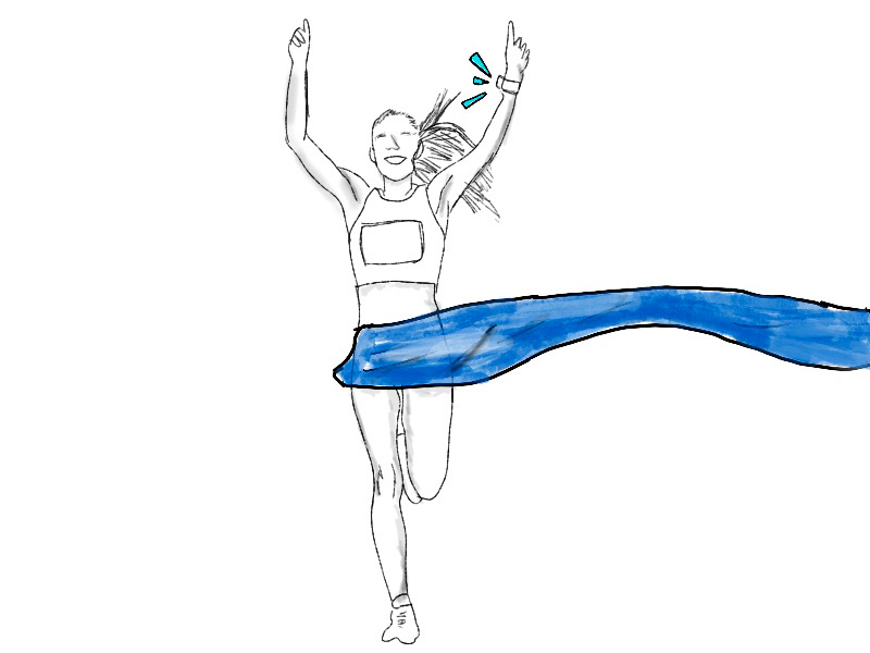
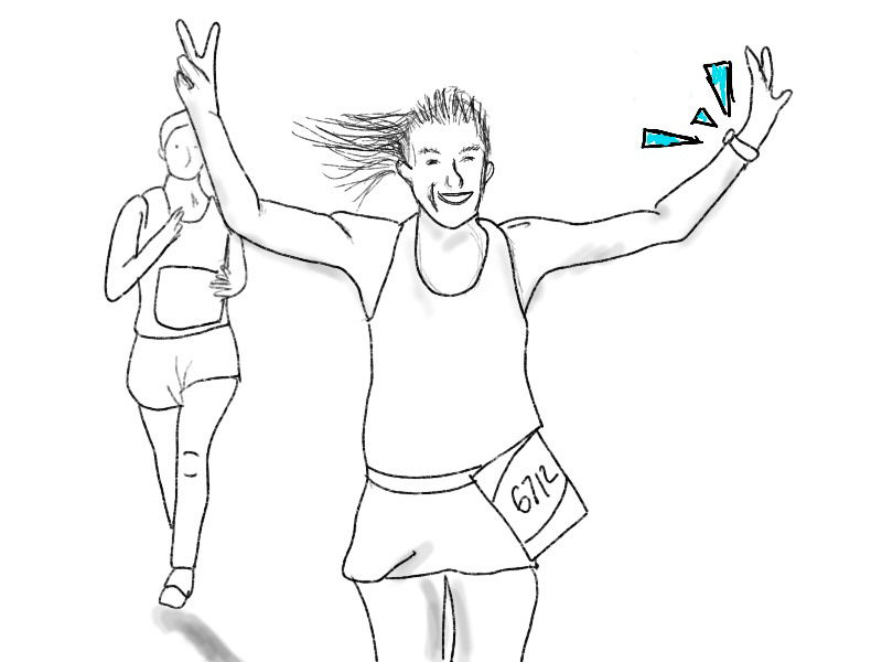
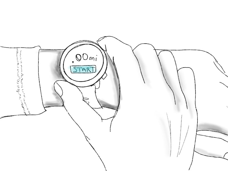
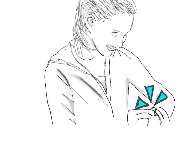
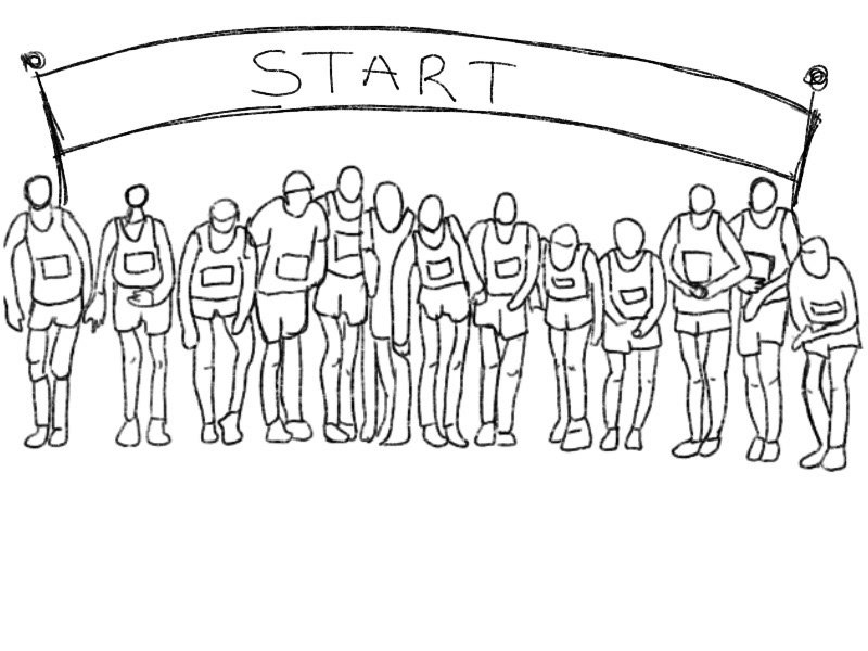
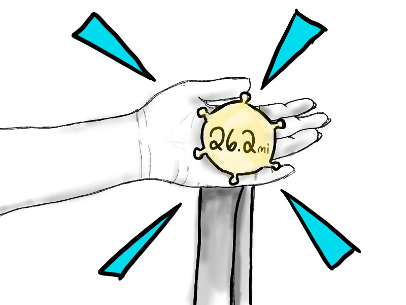
The concept that we designed our campaign around was the idea of having the technology that Garmin provides and achieving the end goal, all by having the power of the technology of Garmin. Ex. the watch helped achieve your goal of finishing the marathon, the fish tracker help catch your fish, the hiking analytics of the watch helped reach your mountains peak, etc.