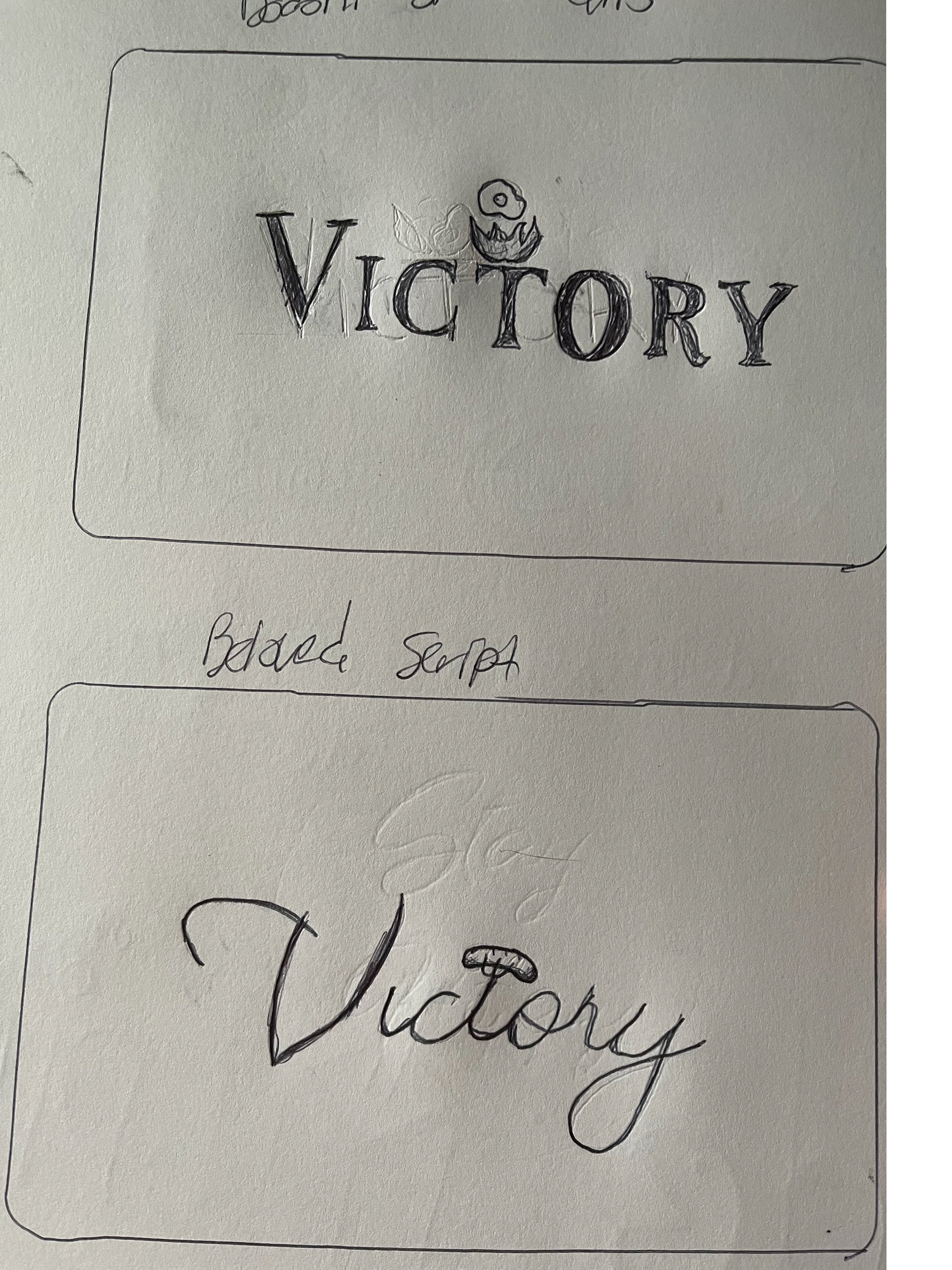
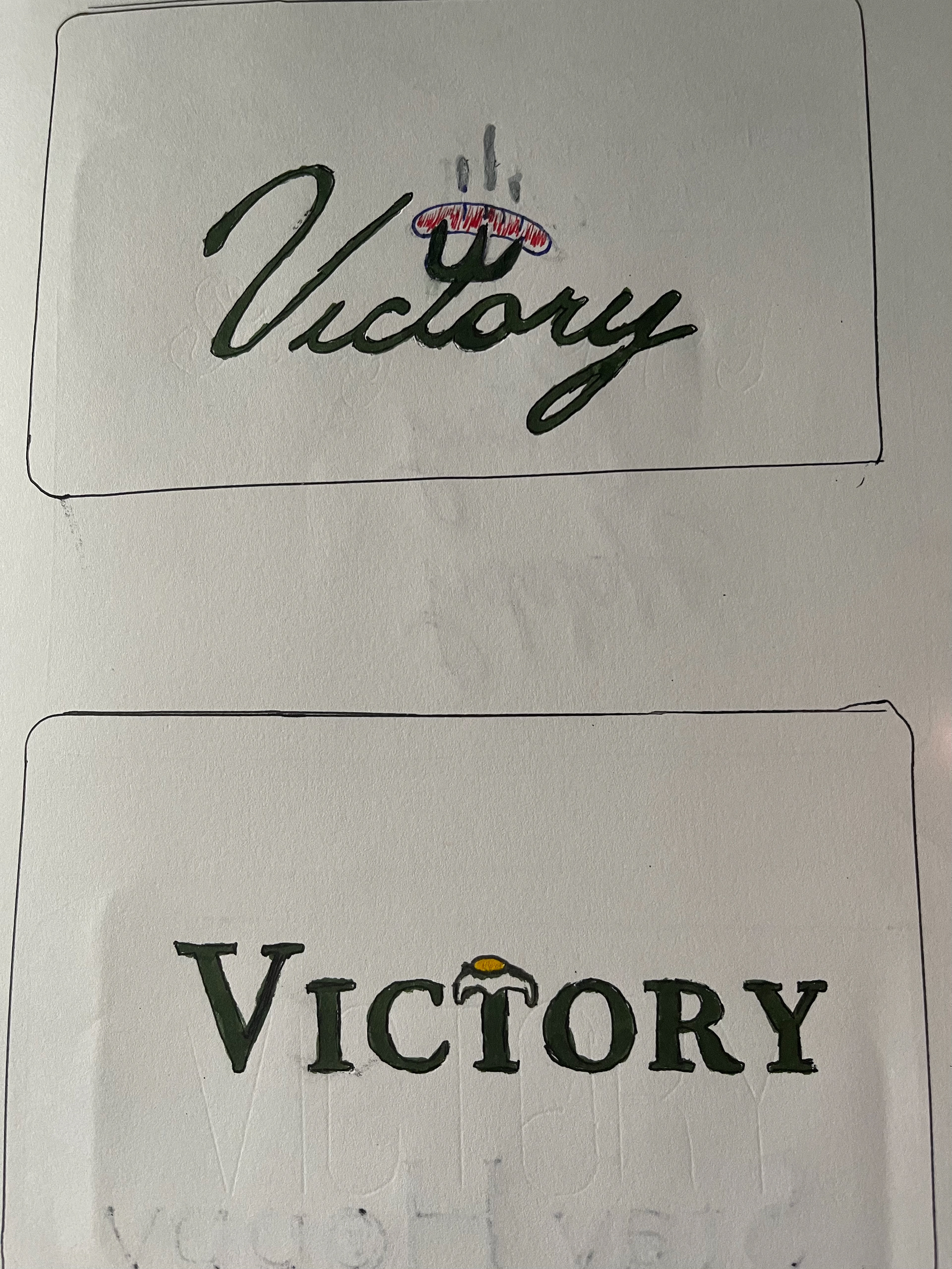
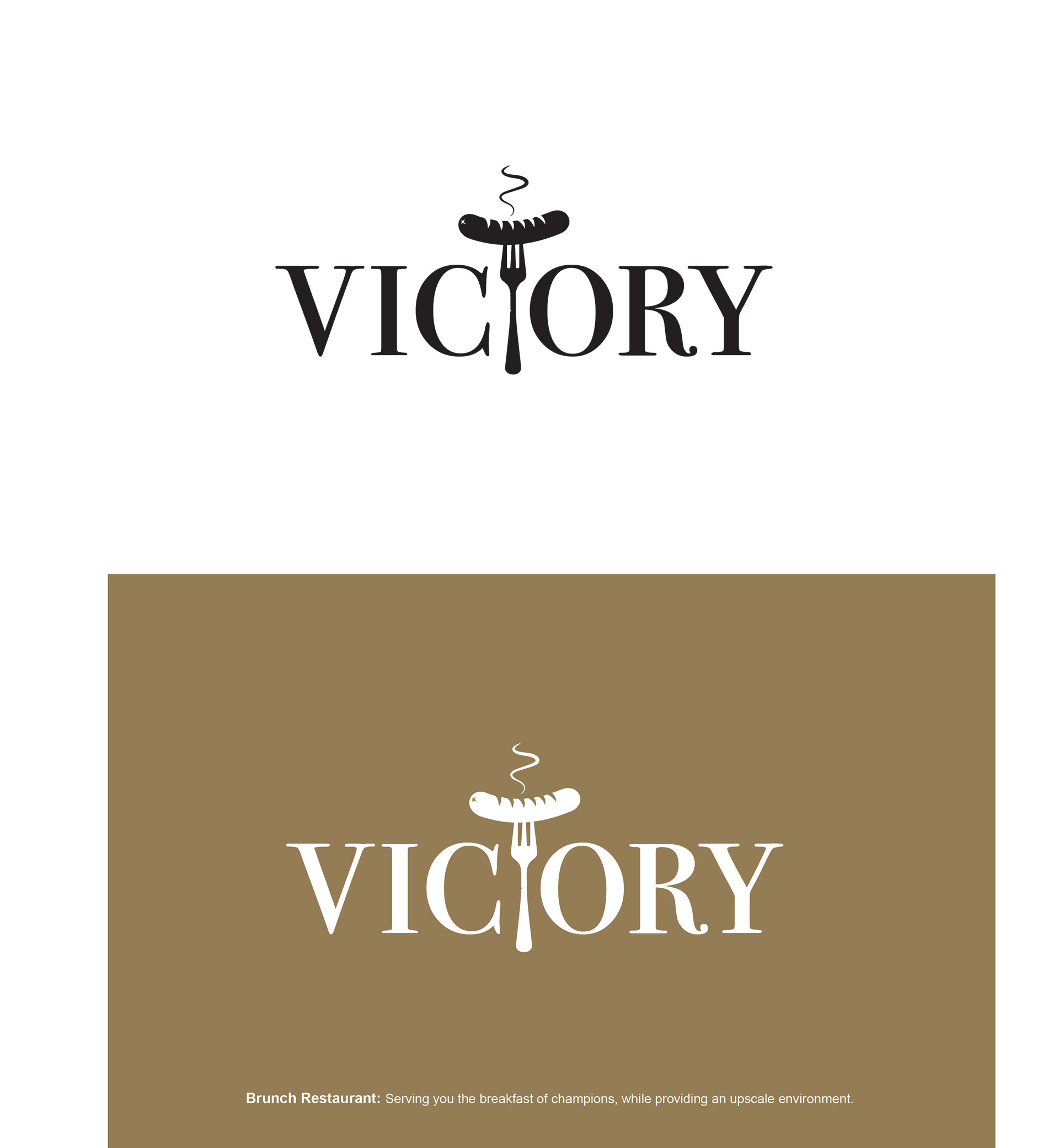
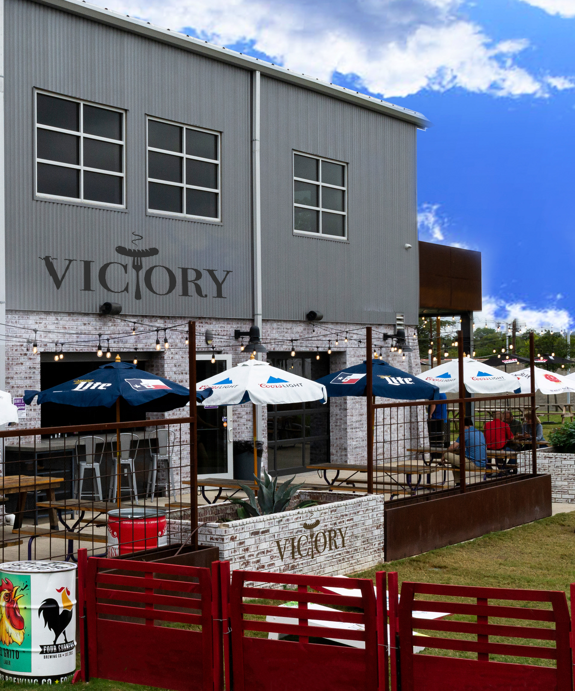
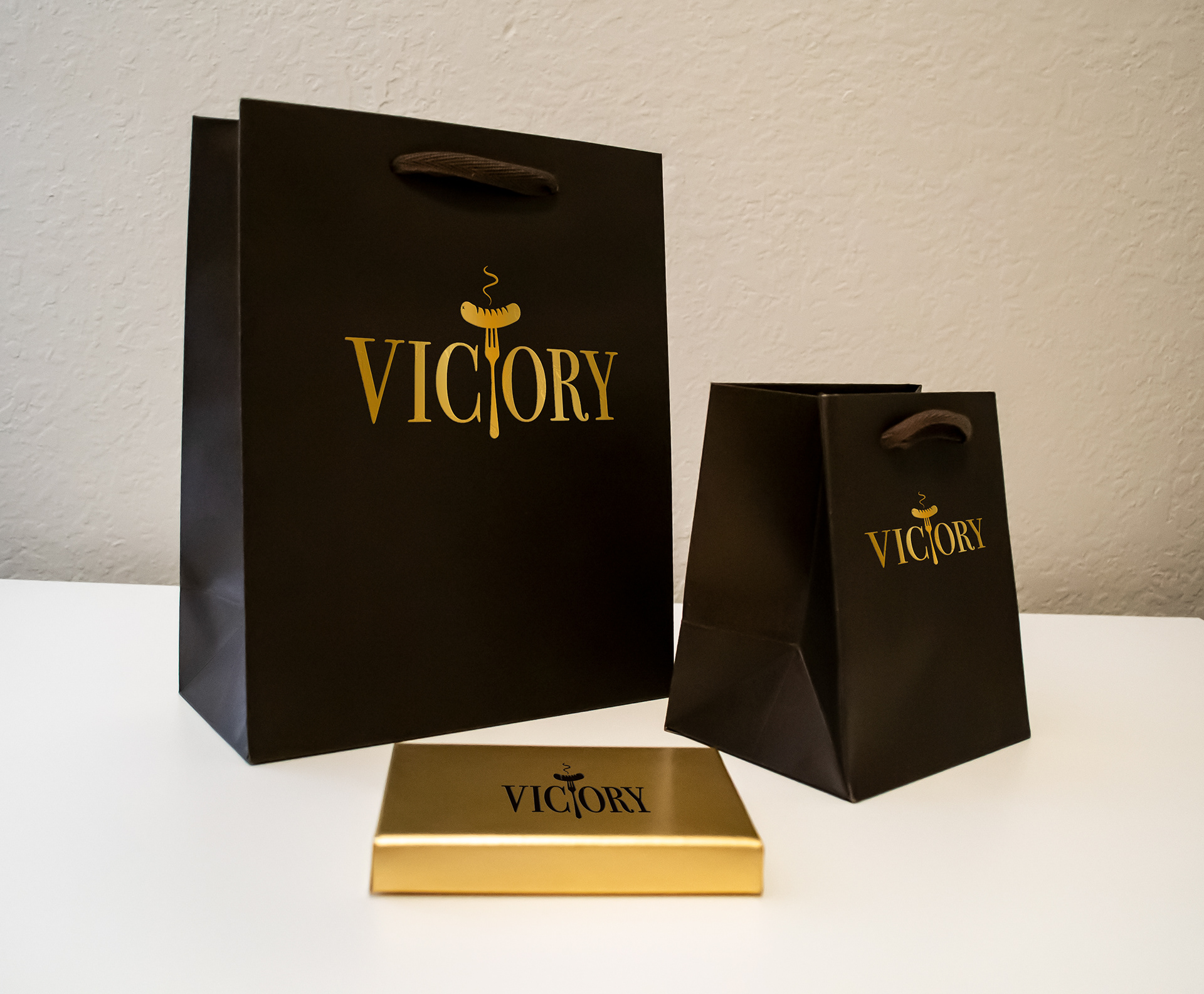
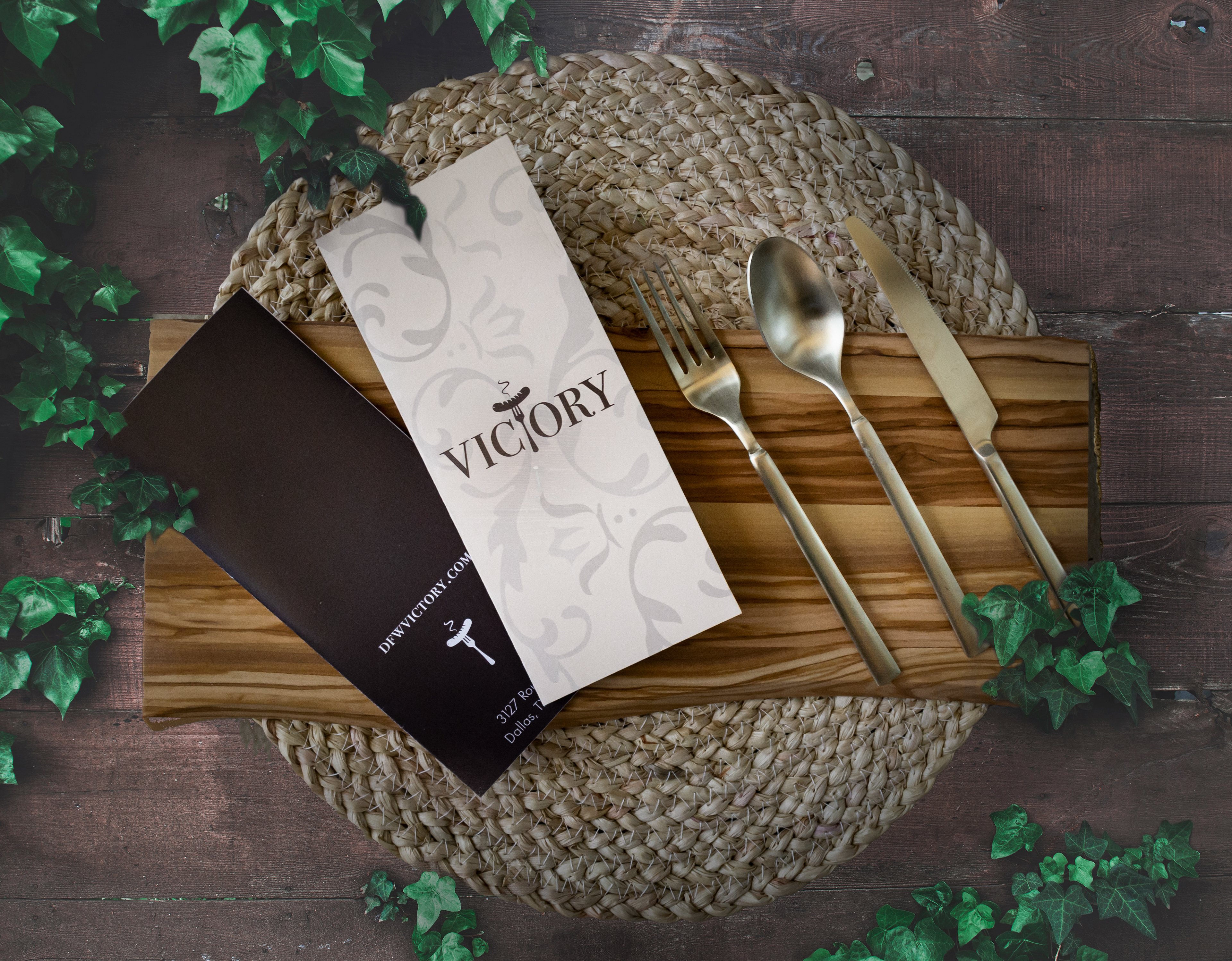
Victory is designed to be a fun atmosphere brunch restaurant that has a higher end target market audience. The Bodoni small caps is incorporated to have that modern and elegant feel to the restaurant. While having the T replaced symbolically with a fork piercing a sausage. Having the fork extending above and below the cap and baseline it gives it a focal point for the letter mark. This design incorporates a letter mark, using gold as a secondary color, letter mark placement on a building, packaging for the restaurant, and menu design.